At altr, we often talk about the good effective user experience design can do. With many of our engineering-founded clients, a rethink of a product’s user experience can take it from good to great. But in certain industries, we may not talk enough about how a poor user experience isn’t just suboptimal, but dangerous.
This past week WBUR’s Common Health reported on how gag orders are constraining physician feedback on the usability of some of one of the most widely used electronic health records, and that usability issues on those systems are putting patients at risk. The WBUR report followed an earlier Kaiser Health News and Fortune investigation on how interoperability problems, incomplete updates, and poorly designed user experiences have, according to Fortune “created a host of largely unacknowledged patient safety risks… patient deaths, serious injuries, and near misses—thousands of them—tied to software glitches, user errors, or other flaws.”
As WBUR reported, it’s estimated that between 1 and 2 percent of medical malpractice cases “involve some problem with electronic health records” and according to Darrell Ranum, a VP at The Doctors Company, “That’s probably the tip of the iceberg.” Common prescriptions are hidden among a universe of potential scripts, metric and standard units of weight are confused, and complexity has turned physicians’ focus from the patients they are treating to the software they are using.
Many of these problems result from the types of issues we deal with every day: from non-intuitive flows to problems with information hierarchy and prioritization. In short, they are the result of designing a product only against a set of functional requirements instead of seeking to understand and then designing in support of users’ actual workflows.
Bad user experiences lead to inefficient work, increased user error, and less engagement overall. In some industries this is still admissible, but as our world gets more and more dependent on technology, fewer and fewer industries can get away without thinking about user experience as a critical aspect of a product or service. In healthcare, it’s always been critical.
In our own work, we’ve seen how bad user experiences can persist in healthcare, sometimes in a misguided effort to protect patient safety. A few years ago, we set out to redesign the displays for ventilators for patients on life support.
What we found in talking with doctors is that the standard ventilator displays consisted of layers upon layers of legacy screens – still there out of an abundance of caution to be available in very specific cases. But by building on top of old paradigms, the resulting ventilator displays contributed to more confusion, making it harder to determine the signal among an abundance of noise.
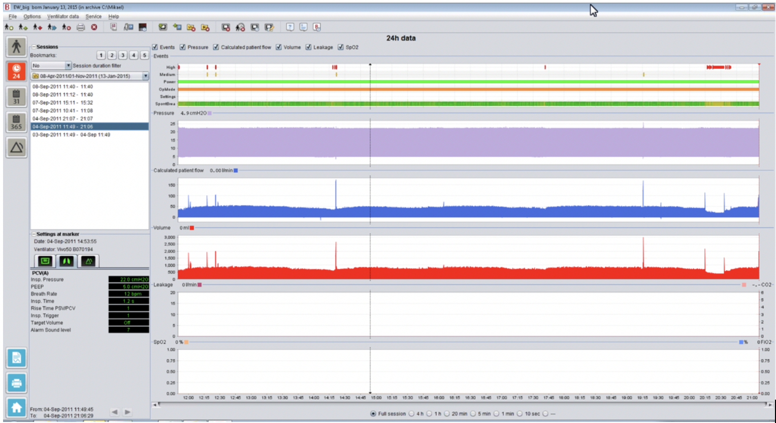
The majority of use cases we found required very similar data displays – and from that foundation, only slight customizations were needed to deal with most unique cases. Instead of layers of screens and confusion, we designed a new, single interface that defaulted to a standard view, yet could be easily customized as needed by a doc.
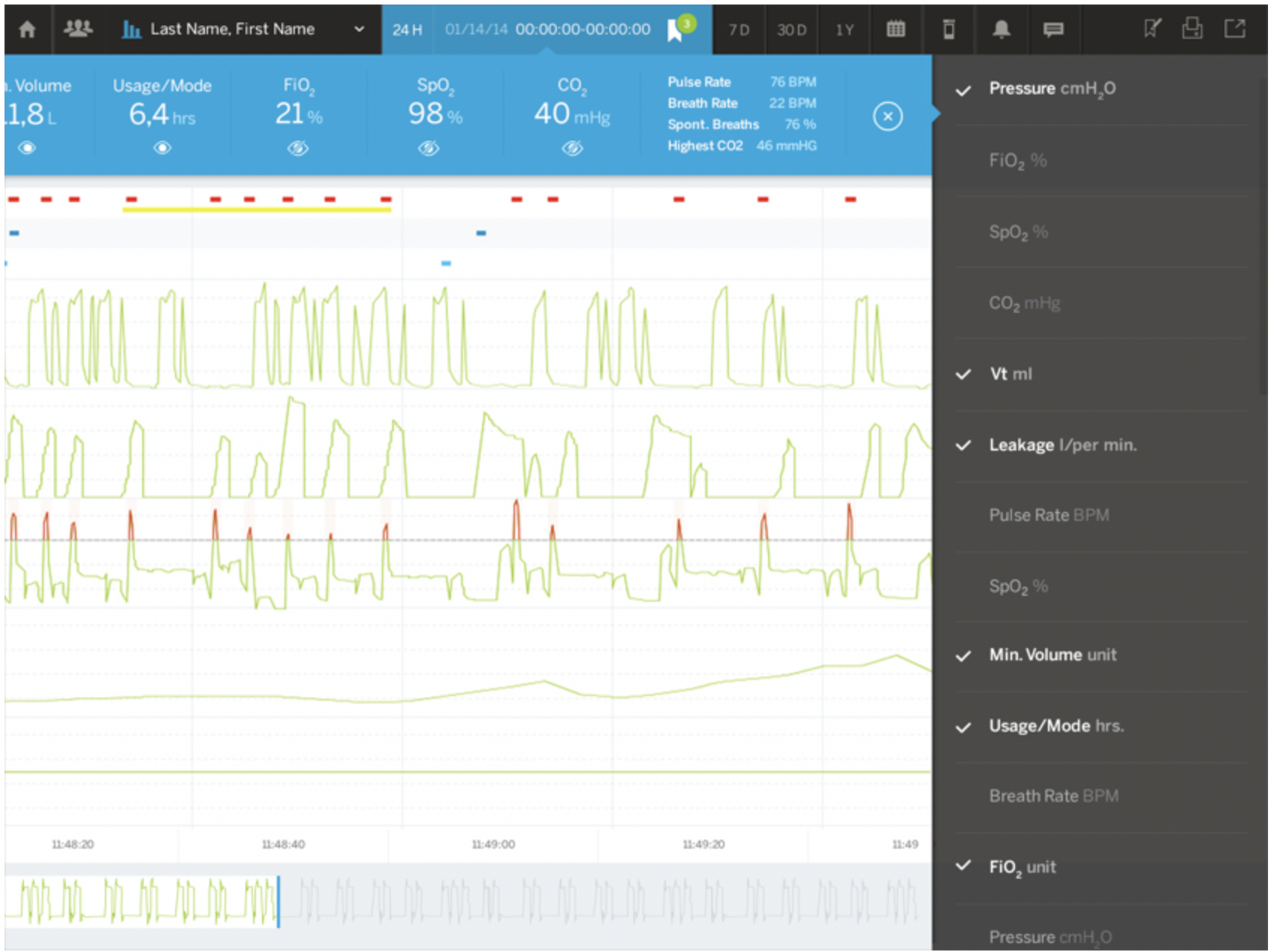
This simplified display then gave us room to add new functionality that served physicians’ actual workflows, including simple ways to isolate and share abnormalities in patient data with a broader care team and a patient population management interface that allows physicians to set thresholds and alarms to more effectively monitor groups of patients on ventilators.
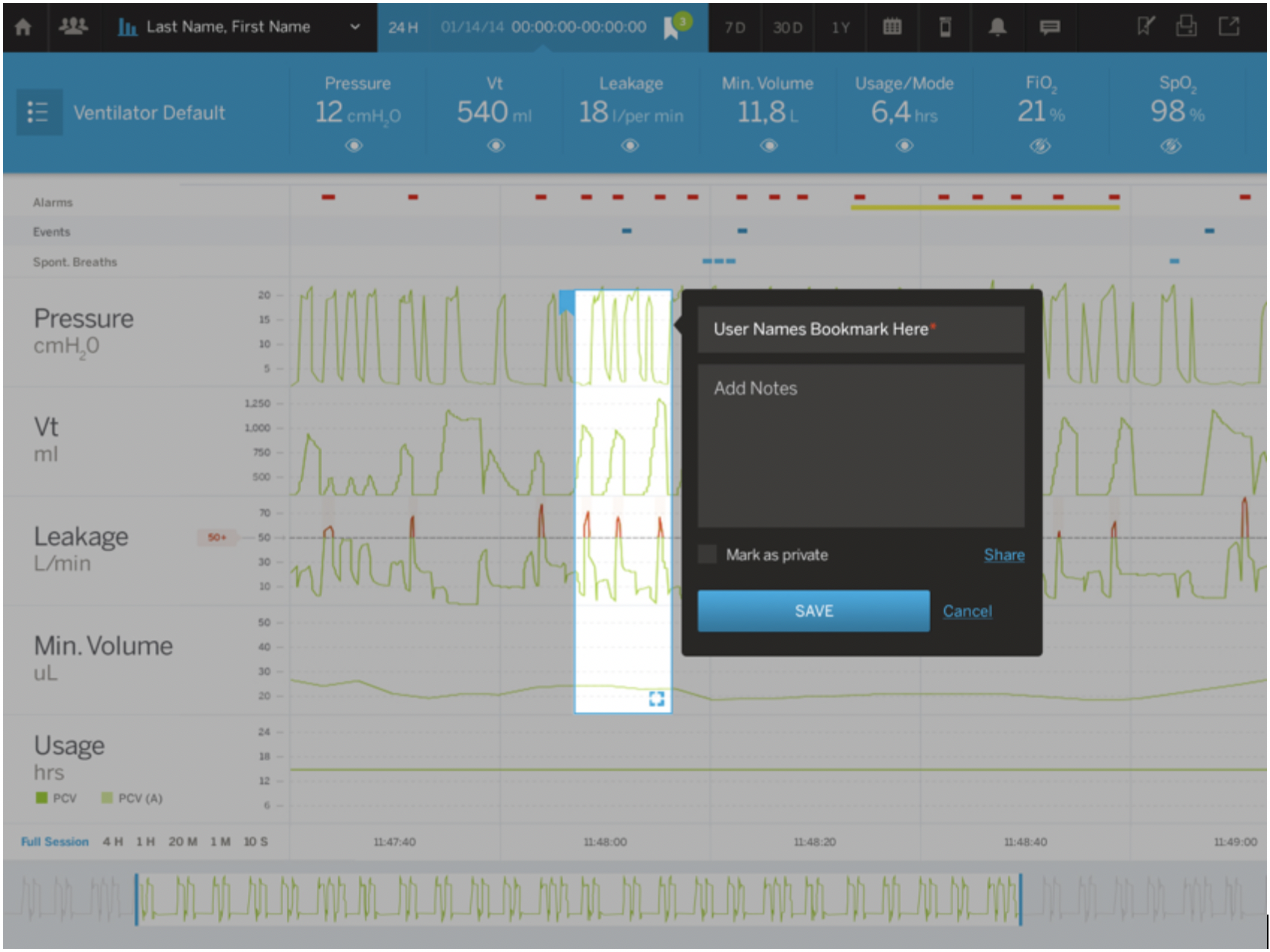
Ultimately our design had to account for every functional requirement for the ventilator display, but importantly, we didn’t start by designing against functional requirements – we started with a view into how physicians worked, what works well, where they face challenges, where they see opportunities for improvement. It’s only with that view that we could then put the functionality requirements in the context of user needs and behaviors, and then design a solution that works.
Back to EHR, this approach could have mitigated one of the problems cited in the WBUR report:
“Say a doctor wants to order Tylenol for an adult male patient at a very common dosage — 500 milligrams. The screen may show 86 different possible Tylenol orders, including some for children and women. That kind of information overload is not just tiring for doctors, Ratwani says — it can lead to wrong medications being selected.”
These interfaces were clearly designed against a set of functional requirements that said there are 86 different possible Tylenol orders: 86 different Tylenol orders means we need a screen that allows users to select from one of 86 options.
But if the interface were designed to serve actual physician behaviors, the most common dosage would be featured, reducing the noise that would lead to an incorrect order while also allowing the physician to search for and prescribe less common orders. Based on actual prescribing behaviors, all 86 Tylenol orders are not equal and they shouldn’t be presented as equal in the EHR interface.
These may seem to be little things, but the data shows these flaws can prove fatal. In time we may come to realize that good user experience is a critical element to staying true to the Hippocratic oath’s promise to “do no harm.”
altr was recognized by DesignRush as one of the top 15 UX agencies of 2020.


